
5 Ways to Design More Efficiently in Affinity Designer
I just had the experience of creating a collection of designs and products in a short amount of time. While I did manage to accomplish it, if it weren’t for some of these time-saving techniques, I’m not sure I would have gotten things done in time.

For the most part, I’m usually designing from presets that I have saved based on common sizes and settings that I create. For example, I have a preset for making vertical Instagram posts, a preset for making 5x7 greeting card designs, a preset for a 6x9 Amazon book page, etc.
These presets are for designs that I create quite often so all I have to do is select the preset option and my artboard or canvas area is ready to go for designing.
Templates come in handy when I’ve created a document that uses repeat symbol like my different repeat pattern layout templates. I have a template for creating full drop repeat patterns, half drop repeat patterns, diamond repeat, scallop repeat, and few other layouts.
There’s a couple of ways that I have saved color palettes in Affinity Designer:
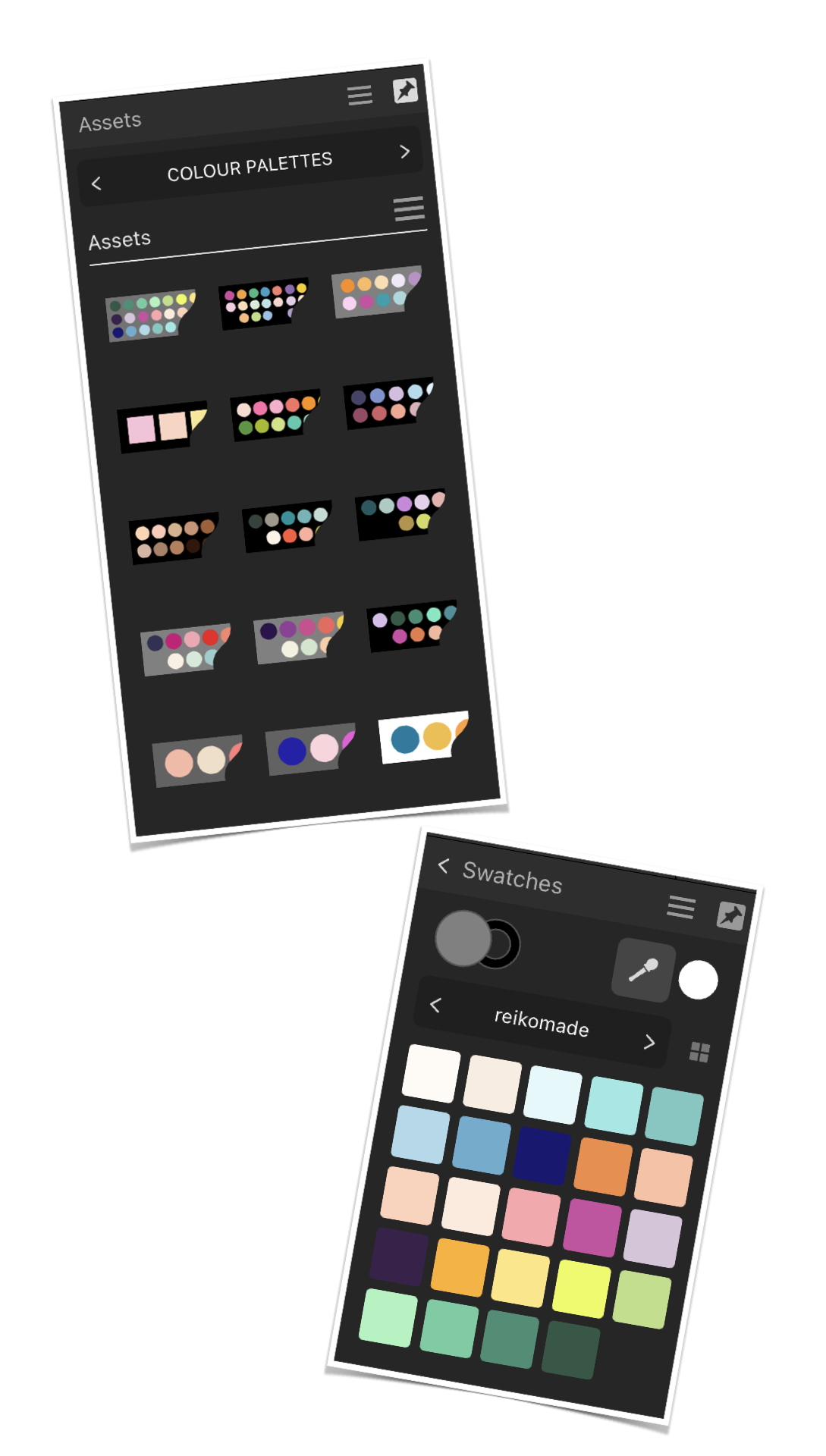
Method 1
You can create a palette graphic and then save that in a “Colour Palette” category in your Asset Library. When you need to use the palette, insert the asset into your document and use the eye dropper to pick the color from the graphic.
Method 2
You can create a new palette in the “Colour” panel then select that color swatch when you need to change the fill or stroke color.
For the most part, I’ll add colour palette graphics to the asset panels for different projects BUT if there’s a set of colours that I’m using all the time, like my brand colours, then I feel it’s better to create a new palette.


Saving and using elements from the Assets Library was an absolute lifesaver when it came to building my design collection in a short amount of time.
As I would create individual design clusters, I would add them to my library so I could easily re-use and insert them into future designs.
You can name your asset library categories and sub-categories to whatever makes sense to you. At first, I was naming them in overall general categories like “Food & Drink” or “Travel” but then I started to name them to match collections that I created them for.

While I don’t use symbols in every illustration, they are a great time saving tool when you need to repeat elements in an illustration or when you want to create symmetrical designs.
I have used symbols to create repeat patterns, to create symmetrical borders around a lettering design, and to create the front view of a face.
I have also created a symbol for an element that I know I’ll repeat a lot in a design because I only have to edit the one symbol and everything else updates automatically.


In the past, if I am creating a collection of products that are going to have the same design theme, I have added different sized artboards to my document so I can see how all of the products are working together. I used to do this a lot when creating printable party decor sets for my Etsy shop. I would add different US Letter sized artboards (because my files were meant to be printed from home) and each would have a different printable design on it - I had an artboard for the invitation, an artboard for gift tags, and an artboard for cake toppers, etc.
Lately, I’ve been using artboards for multiple variations of the same product. For example, when creating my manuscript for my Blooming Whales notebooks designs, all of the different page designs were in the same document but on different artboards.
Now, in mentioning all this, I do want to be clear that these tips are not meant to implement all at once in the same document. But knowing that you can start taking advantage of these tips to make the design process just a little bit quicker, is a great tool to have in your toolbox.